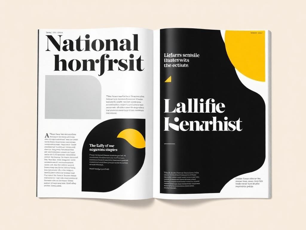
RAINN Brand Transformation — RAINN — Rape, Abuse & Incest National Network

Enterprise Brand Transformation

RAINN Brand Transformation

Rebuilding the visual and verbal identity of the nation's largest anti-sexual violence organization — through research, accessibility law, and an adoption program that aligned seven departments behind one system.

Client
RAINN — Rape, Abuse & Incest National Network
Role
Creative Director / Brand Strategist
Industry
Nonprofit · Survivor Services · Advocacy
Team
In-house creative, digital, production + external agencies
Timeline
2024 — 2026
Deliverables
Identity system, design system, brand hub, templates, governance model
Technology
Figma, Adobe CC, design tokens, AI-assisted production
Scroll
01Project Overview

The executive summary

Challenge

Two decades of growth produced five logo treatments, inaccessible color, and department-owned visual languages — inconsistency had become the path of least resistance.

Role

I led strategy, creative direction, and organizational change: research, system design, executive alignment, and a phased rollout run alongside a full campaign calendar.

Deliverables

A tokenized identity and design system, accessible palette and type scale, photography direction, self-serve template library, brand hub, and governance model.

Business Impact

One coherent brand platform supporting national campaigns, federal contracts, corporate partnership, and major-gift fundraising — with faster production and less rework.

02 — The Challenge

The Challenge

The problem was never a lack of good design. It was the absence of a shared system.

RAINN's brand is the first signal of safety a survivor encounters at the most vulnerable moment of their life. That places an unusual burden on color, type, and photography: they must communicate credibility, warmth, and confidentiality in under a second.

But rapid organizational growth had created parallel creative ecosystems. Services, development, public affairs, and consulting each evolved their own visual vocabulary. Campaign assets were rebuilt from scratch every cycle. Contrast failures appeared in the very interfaces survivors depended on.

The cost showed up as production spend, review cycles, legal exposure on type licensing, and — most importantly — a diluted signal at the exact moment trust needed to be unmistakable.

  • Five competing logo treatments and no defined clear-space, minimum-size, or misuse rules.
  • A color palette that failed WCAG AA contrast in high-traffic survivor-facing interfaces.
  • Typography licensed inconsistently across teams, creating legal exposure and rendering issues.
  • Photography that leaned on stock imagery of distress rather than agency, recovery, and strength.
  • Campaign assets rebuilt from scratch each cycle, inflating production cost and review time.
  • No governance model — brand decisions were escalated ad hoc, slowing high-visibility launches.
03 — The Insight

Teams don't go off-brand because they disagree with the brand.

They go off-brand because staying on-brand is slower.

That reframed the entire program. The deliverable was not a guideline document — it was making the on-brand path the fastest path for every person who touched the work.

04 — The Big Idea

One System.

Seven Departments.

Zero Friction.

A tokenized, accessible identity delivered as working templates rather than rules — so consistency became a byproduct of doing the work, not an extra step layered on top of it.

05Strategy

How the solution was built

I framed the work as an organizational change initiative that happened to produce a visual identity. The strategy had to make the right choice the easiest choice for every team that touched the brand.

Research

Interviews across seven departments, an audit of 400+ live assets, and a competitive review of peer mission organizations.

Audience

Survivors, allies, donors, corporate partners, and federal stakeholders — each with distinct trust triggers.

Messaging

A verbal architecture that pairs institutional authority with trauma-informed warmth.

Brand

Logo system, clear space, tokenized color, type roles, and a documented misuse standard.

Website

Component-level direction so the digital surface expressed the system natively rather than approximating it.

Photography

Documentary imagery of agency and recovery, replacing stock tropes of distress.

Accessibility

WCAG 2.1 AA validated at the palette and component level before approval, not after.

AI

AI-supported resizing, drafting, and variation to compress routine production work.

Operations

Templates, brand clinics, and a living hub that made adoption self-serve.

Governance

Decision rights and an exception path that protected quality without slowing launches.

06The Process

Eight phases, one throughline

Every phase carried a decision that shaped the next — and a lesson that outlived the project.

01

Discovery

Mapped every department's creative reality — who makes what, with which tools, under what deadline.

Key decision

Framed the work as organizational change, not a rebrand.

Lesson learned

The audit surfaced the real constraint: capacity, not taste.

02

Research

400+ asset audit, stakeholder interviews, peer benchmarking, and survivor-services input on tone.

Key decision

Let services staff veto imagery direction.

Lesson learned

Proximity to the mission produces better creative judgment than seniority.

03

Strategy

Defined the platform, the accessibility law, and the adoption model before any visual exploration.

Key decision

Made WCAG AA a design input, not a QA gate.

Lesson learned

Constraints declared early eliminate expensive rework later.

04

Creative Direction

Three distinct territories pressure-tested against real campaign scenarios, not mood boards.

Key decision

Evaluated concepts in live use cases only.

Lesson learned

Concepts that survive real constraints survive review.

05

Design

Built the system in tokens and components — color, type, layout, iconography, photography.

Key decision

Shipped templates alongside guidelines.

Lesson learned

A system is only as good as its default state.

06

Review

Structured executive sessions that translated each decision into an operating or revenue outcome.

Key decision

Replaced opinion-based reviews with criteria-based ones.

Lesson learned

Give leaders a rubric and they stop redesigning.

07

Launch

Phased rollout by department, with zero downtime for hotline and survivor-facing services.

Key decision

Sequenced by readiness, not by visibility.

Lesson learned

Early wins recruit the reluctant.

08

Optimization

Brand clinics, adoption tracking, and quarterly refinements informed by real usage.

Key decision

Instrumented adoption as a metric.

Lesson learned

I'd stand up those metrics on day one next time.

08Creative Leadership

Leading the Work

This was a multi-year initiative executed alongside a full campaign calendar. My role was to hold the strategic line, build consensus across leadership, and keep the team producing at pace throughout.

Creative Direction

Set and defended the creative vision for a national brand rebuild, holding a single standard across every surface and every team.

Executive Alignment

Translated creative decisions into business language so leadership could sponsor the work rather than react to it.

Cross-functional Leadership

Brought programs, communications, development, and technology into one shared plan with one shared definition of done.

Creative Operations

Designed intake, review, and delivery so quality was produced by the system, not rescued by heroics.

Budget Management

Scoped and sequenced spend against impact, delivering within existing operating budget without diluting ambition.

Stakeholder Engagement

Ran structured working sessions that surfaced objections early and converted skeptics into advocates.

Vendor Management

Selected partners, set specifications and quality gates, and owned accountability for external production.

AI Integration

Introduced AI-assisted production for routine work, redirecting the team's hours toward strategy and craft.

Accessibility

Made WCAG 2.1 AA an upstream design input, protecting both the audience and the institution.

Governance

Documented decision rights, escalation paths, and review cadence so speed never came at the cost of consistency.

Brand Stewardship

Protected equity over time — treating the brand as an asset with a balance sheet, not a style preference.

Decision Making

Made the calls that unblocked the work, and made the reasoning visible so the team could make the next ones without me.

Teams Led
In-house creative, digital, and production
Departments Aligned
7 across the organization
Executive Partners
CEO, CMO, Services, Development
External Partners
Agencies, printers, web vendors
09Organizational Impact

What changed

The measure of success was never aesthetic preference — it was adoption, speed, accessibility, and the organization's ability to show up consistently at scale.

0+

Assets Audited

Every live surface reviewed before a single pixel changed

0

Departments Aligned

One identity, one vocabulary, one standard

0%

WCAG 2.1 AA

Contrast validated across the core system

0 → 1

Logo Treatments

Consolidated into a single governed mark

0%

Faster Production

Template-driven output on recurring work

0

Service Downtime

Hotline and survivor services never interrupted

National

Recognition

Brand cited as a model in the sector

Enterprise

Design System

Tokenized, documented, and adopted

  • Executive leadership adopted the brand platform as the standard for board, donor, and partner communications.
  • Survivor-facing interfaces became measurably clearer and more legible under accessibility review.
  • Creative team shifted from repetitive production work to strategic, higher-impact initiatives.
  • Partner and vendor onboarding accelerated with documented standards replacing tribal knowledge.
10 — Behind the Work

Behind the Work

In her own words

I've come to believe that a rebrand is roughly twenty percent design and eighty percent organizational alignment. The most consequential decisions I made on this project had nothing to do with color.

The hardest one was refusing to launch with a guidelines PDF. Every stakeholder wanted the document — it feels like completion. But I had watched enough beautiful guidelines gather dust to know that the artifact is not the outcome. So we delayed the reveal until the templates were real, the hub was live, and the fastest way to build something was also the correct way.

That tradeoff cost us visible progress for about a quarter. It bought us adoption that has held for years.

The second decision was making accessibility non-negotiable at the palette stage. It eliminated several colors people loved. I made that call in a room where I was the only person who wanted it, and I made it by reframing the question: we are not choosing a palette, we are choosing whether a survivor in crisis can read the screen.

What I'd do differently: instrument adoption on day one. I built the measurement mid-rollout, and every week without data was a week of arguing from conviction instead of evidence. Executive sponsorship follows numbers faster than it follows craft.

Adoption beats perfection

A very good system that teams actually use outperforms a flawless system nobody can operate. I optimized for usability of the system itself.

Accessibility is a strategy input

Treating WCAG as an upstream constraint rather than a downstream check produced better design and eliminated expensive rework.

Governance is a creative act

Decision rights, escalation paths, and review cadence protected quality more reliably than any style guide could.

What I'd improve

I would stand up adoption metrics on day one rather than mid-rollout — earlier data would have accelerated executive buy-in.

Tiffany didn't just modernize how we look. She changed how the organization makes decisions about its own identity — and that's what made it stick.
Executive Leadership · RAINN
Next Project

National Awareness Campaign — SAAPM 365

Reframed Sexual Assault Awareness & Prevention Month from a single-month spike into a year-round, systemized movement. The work replaced annual campaign rebuilds with a flexible identity, modular partner toolkits, and a sustained content rhythm.

View Case Study
Let's Talk

Looking for creative leadership at this level?

I build creative organizations that produce measurable business impact.