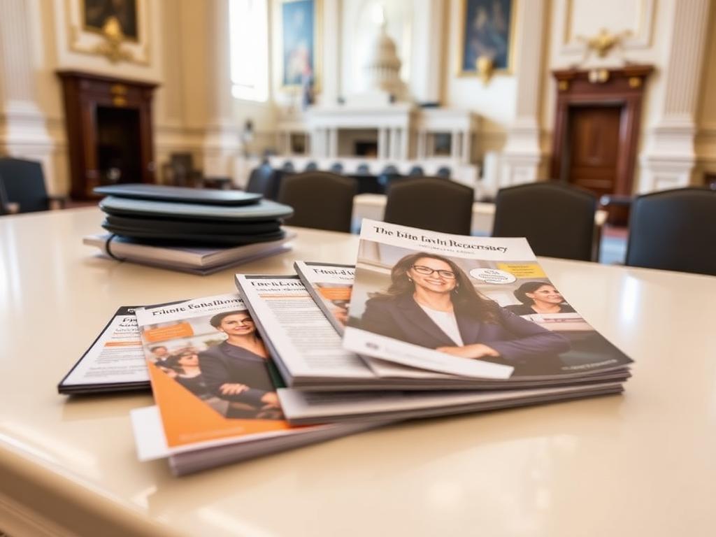
Discovery
Mapped the actual meeting: who speaks, when, and what's physically in their hands.
Key decision
Designed around the fifteen-minute constraint first.
Lesson learned
The room dictates the format.

Advocacy at Scale
Designing the participant and legislator materials behind a national day of advocacy — information design built to perform in fifteen-minute Capitol Hill meetings, under pressure, in the hands of first-time advocates.
Advocacy materials failed quietly — dense, undifferentiated documents that couldn't be navigated mid-conversation by nervous first-time advocates or scanned in seconds by legislative staff.
I directed the creative work and owned the production risk: audience-split design, information hierarchy, and multi-vendor delivery against an immovable event date.
Participant conversation guides, legislative leave-behinds, policy data visualization, event signage, and a change-tolerant template system.
Higher participant confidence, sharper policy argument in the room, and institutional credibility protected under late-breaking legislative revisions.
Advocacy design fails quietly. A beautiful leave-behind that nobody reads produces no policy outcome.
Congressional Day of Action brings survivors, advocates, and volunteers to Capitol Hill to meet directly with legislators and staff. Meetings average fifteen minutes. The materials people carry are the organization's policy argument made portable.
Two audiences with opposite needs shared the same folder. Participants — many of them survivors sharing personal experience for the first time — needed structure and confidence. Legislative staff needed credibility signals and citation-grade clarity in seconds.
And the policy language moved late. Any design that couldn't absorb a copy change without a redesign was a schedule risk against a date that could not move.
In a fifteen-minute meeting, the material isn't a document.
It's a script, a shield, and a memory.
Once we designed for those three jobs instead of for 'a leave-behind,' the hierarchy resolved itself: one argument per surface, sequenced as a conversation, built to be left behind and still make sense alone.
One Argument.
One Surface.
Fifteen Minutes.
Ruthless prioritization as a design principle — audience-split artifacts, no competing focal points, and layouts engineered to survive late policy revisions without a single hour of rework.
I approached the work as information design for high-stress environments, then made the production plan resilient enough to survive late change.
Observed prior meetings and debriefed advocates on where materials helped and where they got in the way.
Two distinct artifacts — advocate-facing and staff-facing — each optimized for a different job to be done.
One policy argument per surface, sequenced to match the arc of a real conversation.
Data presentation and sourcing calibrated to a policy audience's credibility standard.
Typographic restraint that reads as institutional rather than promotional.
Wayfinding, signage, and check-in materials for a high-volume single-day activation.
Multi-vendor specifications, proofing, and delivery logistics against a hard date.
Type sizes and contrast that hold up in poor lighting and rushed handoffs.
Change-tolerant templates that absorb late copy without redesign.
A single approval path shared by policy, government affairs, and communications.
Every phase carried a decision that shaped the next — and a lesson that outlived the project.
Mapped the actual meeting: who speaks, when, and what's physically in their hands.
Key decision
Designed around the fifteen-minute constraint first.
Lesson learned
The room dictates the format.
Advocate debriefs and staff feedback on what survives after the meeting ends.
Key decision
Split the audiences into separate artifacts.
Lesson learned
One document serving two audiences serves neither.
Defined the argument architecture with policy and government affairs leads.
Key decision
One ask per surface, no exceptions.
Lesson learned
Editing is the highest-leverage design act.
Set a restrained, institutional visual language calibrated for credibility.
Key decision
Removed promotional styling entirely.
Lesson learned
On the Hill, restraint reads as authority.
Built the guides, leave-behinds, data visuals, and signage as a coherent kit.
Key decision
Engineered layouts to absorb copy growth.
Lesson learned
Design for the revision you know is coming.
Compressed review cycles across policy, comms, and government affairs.
Key decision
Single approval path with named approvers.
Lesson learned
Ambiguous decision rights are a deadline risk.
Multi-vendor print, proofing, and on-site delivery for the event day.
Key decision
Built vendor redundancy into the plan.
Lesson learned
Production is where advocacy campaigns actually fail.
Post-event debrief captured what advocates used and what they left in the bag.
Key decision
Retired the pieces nobody opened.
Lesson learned
Usage data beats stakeholder preference.
The process was built backward from the fifteen-minute meeting and forward from the print deadline.
Hover to enlarge. Click any piece for an immersive view.
Signage, wayfinding, and delegation identity across a full day on the Hill.
Single-argument print artifacts engineered for staff scanning after the meeting.
A conversation scaffold that gave first-time advocates confidence in the room.
Mobile-accessible versions of every key asset, available mid-meeting.
Research, policy evidence, and audience mapping worked out before layout.
Day-of amplification designed for participants, partners, and press.
Delivery tracked asset by asset so nothing failed under live conditions.
I directed the creative work while owning the production risk — the part of the project where advocacy campaigns most often fail.
Set and defended the creative vision for a national advocacy activation, holding a single standard across every surface and every team.
Translated creative decisions into business language so leadership could sponsor the work rather than react to it.
Brought programs, communications, development, and technology into one shared plan with one shared definition of done.
Designed intake, review, and delivery so quality was produced by the system, not rescued by heroics.
Scoped and sequenced spend against impact, delivering within existing operating budget without diluting ambition.
Ran structured working sessions that surfaced objections early and converted skeptics into advocates.
Selected partners, set specifications and quality gates, and owned accountability for external production.
Introduced AI-assisted production for routine work, redirecting the team's hours toward strategy and craft.
Made WCAG 2.1 AA an upstream design input, protecting both the audience and the institution.
Documented decision rights, escalation paths, and review cadence so speed never came at the cost of consistency.
Protected equity over time — treating the brand as an asset with a balance sheet, not a style preference.
Made the calls that unblocked the work, and made the reasoning visible so the team could make the next ones without me.
Success was measured in meeting effectiveness, participant confidence, and flawless delivery.
0 min
Meeting Window
Every artifact designed for this constraint
0
Audience Systems
Advocate-facing and legislator-facing
0%
On-Time Delivery
Against an immovable event date
0
Reprints Required
Change-tolerant templates absorbed late revisions
Multi
Vendor Production
Coordinated specs, proofing, and logistics
Capitol Hill
Deployment
Materials used in live legislative meetings
Higher
Advocate Confidence
Structure reduced cognitive load in the room
Protected
Institutional Credibility
Citation-grade clarity for policy staff
In her own words
This is the project I use when someone asks what creative leadership actually means, because almost none of the value was in the aesthetics.
The moment it clicked was watching an advocate in a prior cycle flip through a folder mid-sentence, looking for a number, while a staffer waited. That's a design failure with a policy cost. Everything after that was about removing decisions from a person who is already carrying enough.
The tradeoff I chose was less content. Policy teams, correctly, want to say everything true and important. I cut roughly half of it. That is an uncomfortable conversation to lead, and the only way through it was to make the argument in terms of outcomes: what gets read, in fifteen minutes, by someone who has four more meetings today.
The other thing I owned was production risk. Creative directors sometimes hand that off. On a fixed event date with late policy revisions, the print plan is the creative plan — so I built layouts that could grow, kept vendor redundancy, and treated the schedule as a design constraint rather than an operational afterthought.
Rushed, crowded, emotionally heavy rooms are the real context. Everything that only works in ideal conditions gets cut.
Restraint outperformed comprehensiveness every time. Density is the enemy of persuasion under time pressure.
Owning vendor risk personally was what made the creative ambition possible against a hard deadline.
I would build the digital companion earlier so field feedback could be captured during the event rather than after.
“Our advocates walked into those meetings prepared. The materials did exactly what they needed to do — and they held up when the policy language changed at the last minute.”
Reframed Sexual Assault Awareness & Prevention Month from a single-month spike into a year-round, systemized movement. The work replaced annual campaign rebuilds with a flexible identity, modular partner toolkits, and a sustained content rhythm.
View Case StudyI build creative organizations that produce measurable business impact.